|
|
|
3.5 Bar Diagrams
1) Simple 'Bar diagram':- It represents
only one variable. For example sales, production, population figures
etc. for various years may be shown by simple bar charts. Since
these are of the same width and vary only in heights ( or lengths
), it becomes very easy for readers to study the relationship. Simple
bar diagrams are very popular in practice. A bar chart can be either
vertical or horizontal; vertical bars are more popular.
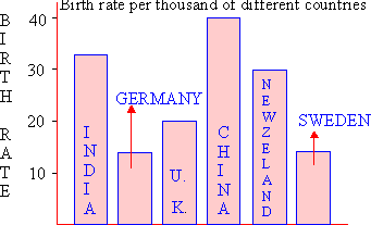
Illustration :- The following table gives
the birth rate per thousand of different countries over a certain
period of time.
|
Country
|
Birth rate
|
Country
|
Birth rate
|
|
India
Germany
U. K.
|
33
15
20
|
China
New Zealand
Sweden
|
40
30
15
|
Represent the above data by a suitable diagram.

Comparing the size of bars, you can easily see
that China's birth rate is the highest while Germany and Sweden
equal in the lowest positions. Such diagrams are also known as component
bar diagrams.
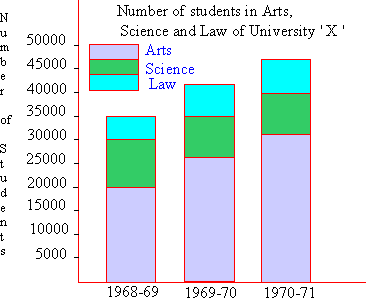
2) Sub - divided Bar Diagram:- While
constructing such a diagram, the various components in each bar
should be kept in the same order. A common and helpful arrangement
is that of presenting each bar in the order of magnitude with the
largest component at the bottom and the smallest at the top. The
components are shown with different shades or colors with a proper
index.
Illustration:- During 1968 - 71, the
number of students in University ' X ' are as follows. Represent
the data by a similar diagram.
|
  Year      Arts      Science      Law    Total
  1968-69   20,000    10,000      5,000   35,000
  1969-70   26,000     9,000      7,000   42,000
  1970-71   31,000     9,500      7,500   48,000

|
Index
3.1 Introduction
3.2 Comparison Between Tabular And Diagrammatic
Presentation
3.3 Difference Between Diagrams And Graphs
3.4 General Principles Of Constructing Diagrams
3.5 Bar Diagrams
3.6 Pie Chart
3.7 Graphs
3.8 Box and Whiskers
Chapter 4
|
